Brand
Logos, colours, and the few rules behind them.
Free to use when you write about Antaryn or link to us. Please don’t redraw, recolour or stretch the wordmark: every letter in it was drawn for us, it isn’t set in a font.
Wordmark




App icon


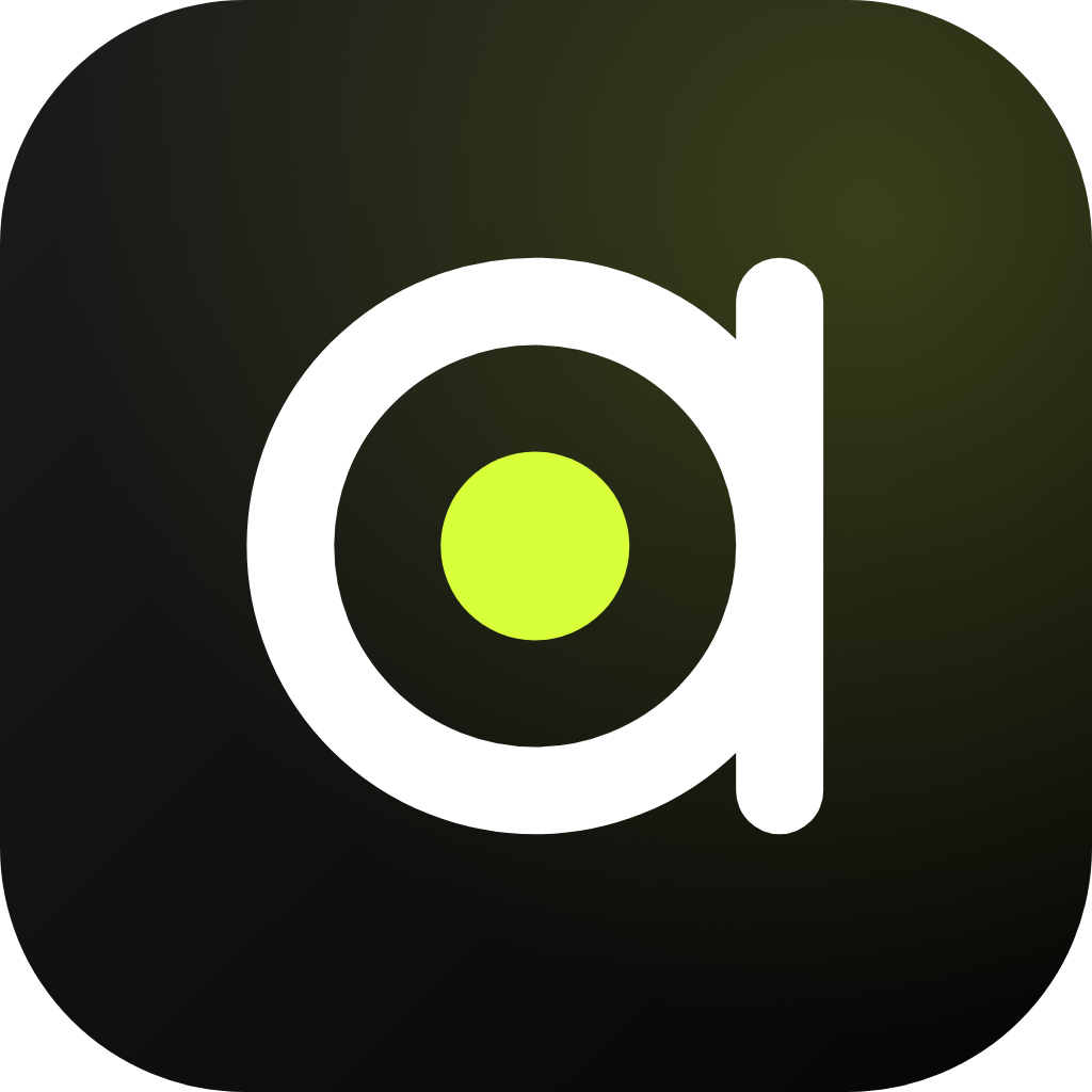
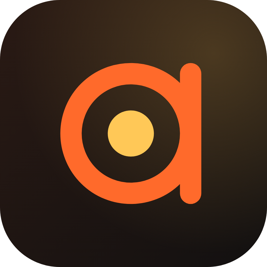
The first a of the wordmark, holding a core: the light within. The same dot ends the y’s launch path in the wordmark: beyond. Keep the a’s stem clearly visible, and never show the icon in red.
Colour
Black and Volt are the main look. Ember is the partner for light surfaces and warm moments. Volt is an accent: if it shows up more than once on a page, one of them is probably too many.
- Black
#0A0A0AMain background - White
#FFFFFFLetters on dark - Volt
#D7FF3AThe accent: the dot, a few highlights - Olive
#6E8F00Volt’s stand-in on white - Grey
#9A9A9ASecondary text on dark - Ember
#FF6A2BLetters on dark, Ember version - Ember deep
#E8480CLetters on white - Amber
#FFC857Ember’s dot on dark - Amber deep
#C98A00Ember’s dot on white
Type
Look within.
Sora
Headlines, labels and buttons.
Launch beyond.
Newsreader
Reading text.
Both are open-source typefaces under the SIL Open Font License. The wordmark is not set in either: its letters were drawn from scratch.
Using the name
- Write the company as Antaryn Technologies, or Antaryn for short. The wordmark is always lowercase; the name in a sentence is not.
- Leave clear space around the wordmark at least as tall as its letter n.
- Use the white wordmark on dark backgrounds and the Ember or black one on light. Don’t place it on busy photos.
- Keep the dot. It is part of the y, not decoration.
Short description
Antaryn Technologies is a technology company from India. It researches new-age technology and builds quality-first products with it, made in India for the world. Its products include audiotale.net, a tech publication and community where every story links its sources; Audiotale is coming soon. More at antaryn.com.
Press questions: hello@antaryn.com